Investments for Everyone with Style
Kameo crowdfunding platform – Website and Web Application
Kameo, established in 2014, is a Scandinavian fintech platform facilitating direct financing for real estate companies from a vast pool of investors. Acting as a supplement to traditional bank financing, Kameo opens doors for private individuals and companies to invest in real estate projects and entities not readily accessible through conventional markets via crowdfunding.
Challenge
As a proven platform with significant annual growth and expansion to the entire Scandinavian market, its branding and UX were not aligned with the importance it had on the market. It was necessary to create simpler user flows and avoid pain points.
Users
Kameo is a meeting point for those who want to invest and companies that need money to implement construction projects.
With Kameo, everyone can invest with style, like Sara from Göteborg, a teacher who has more money and wants to safely earn up to 9% in low-risk investments. On the other hand, there is investor Peter from GreenPro Construction who needs flexible additional financing.
My role
I was invited to design a proposal as a part of the team, alongside the product owner from Zwebb and the Kameo team. I was responsible for the interaction design and visual design of the website and application.
Scope & Constraints
Specific was connecting rebranding and changing the website and application. Rebranding was done externally in several phases and it has been integrated into the website and application proposal.
Process & What You Did
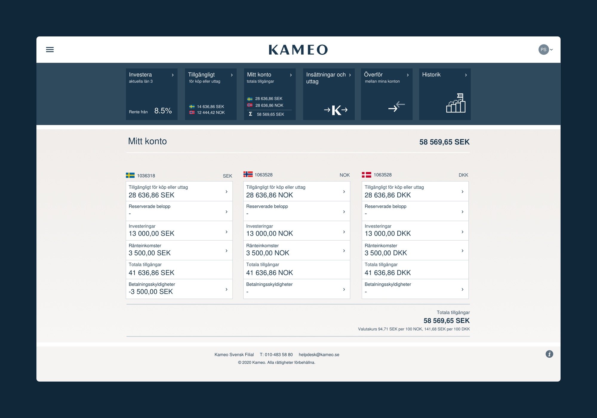
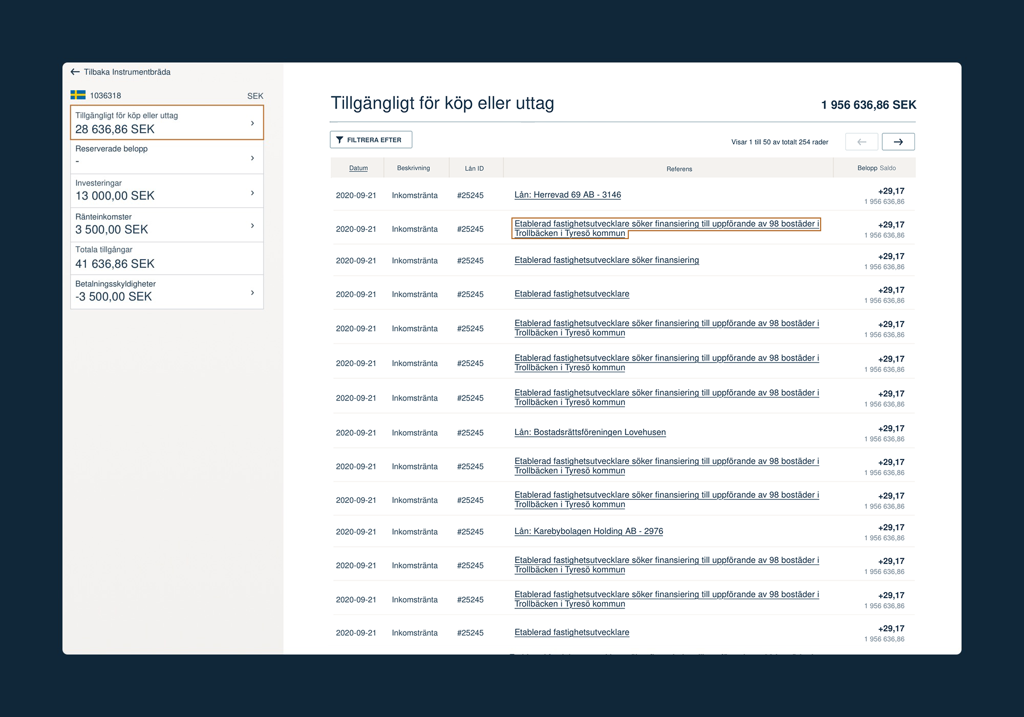
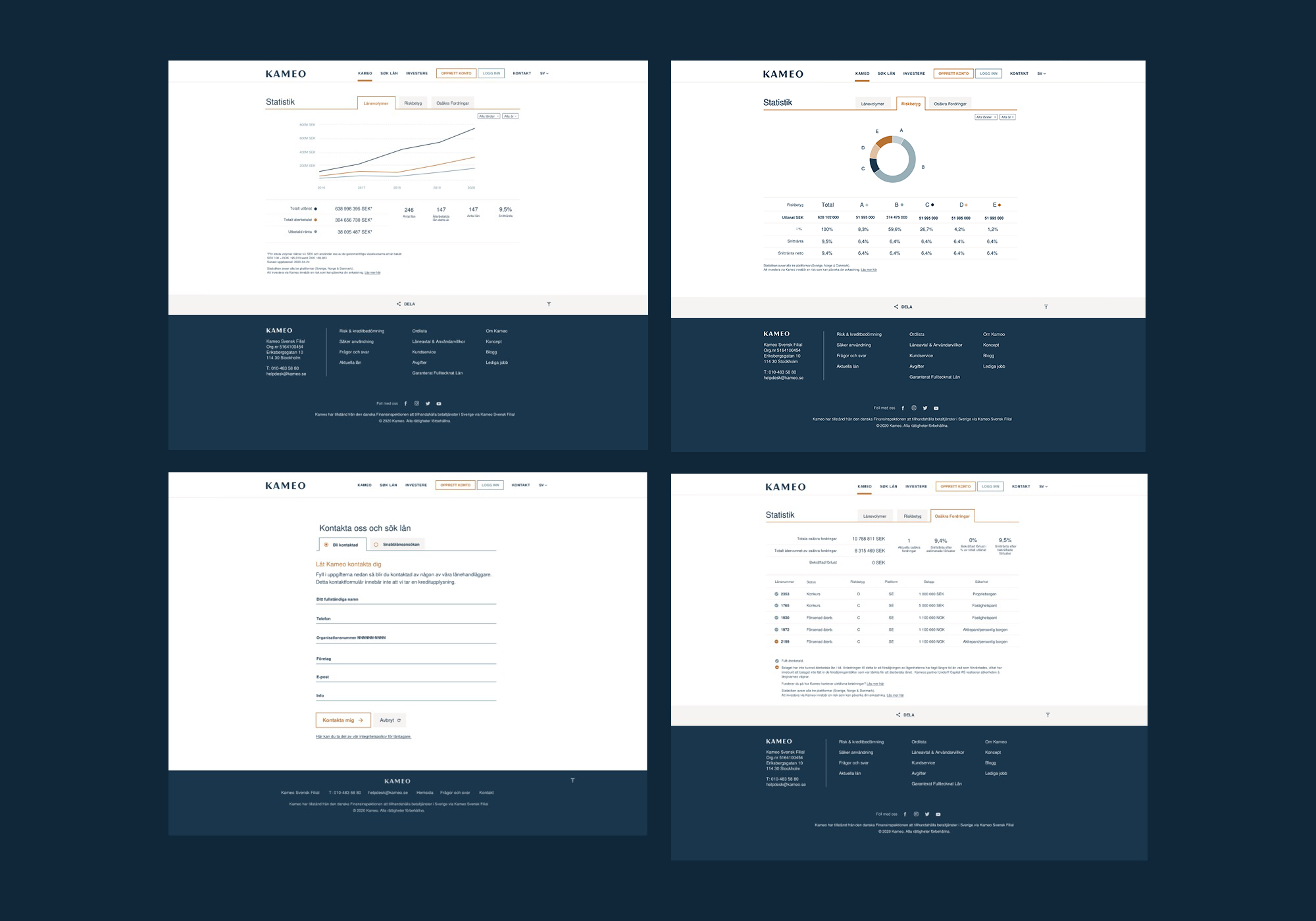
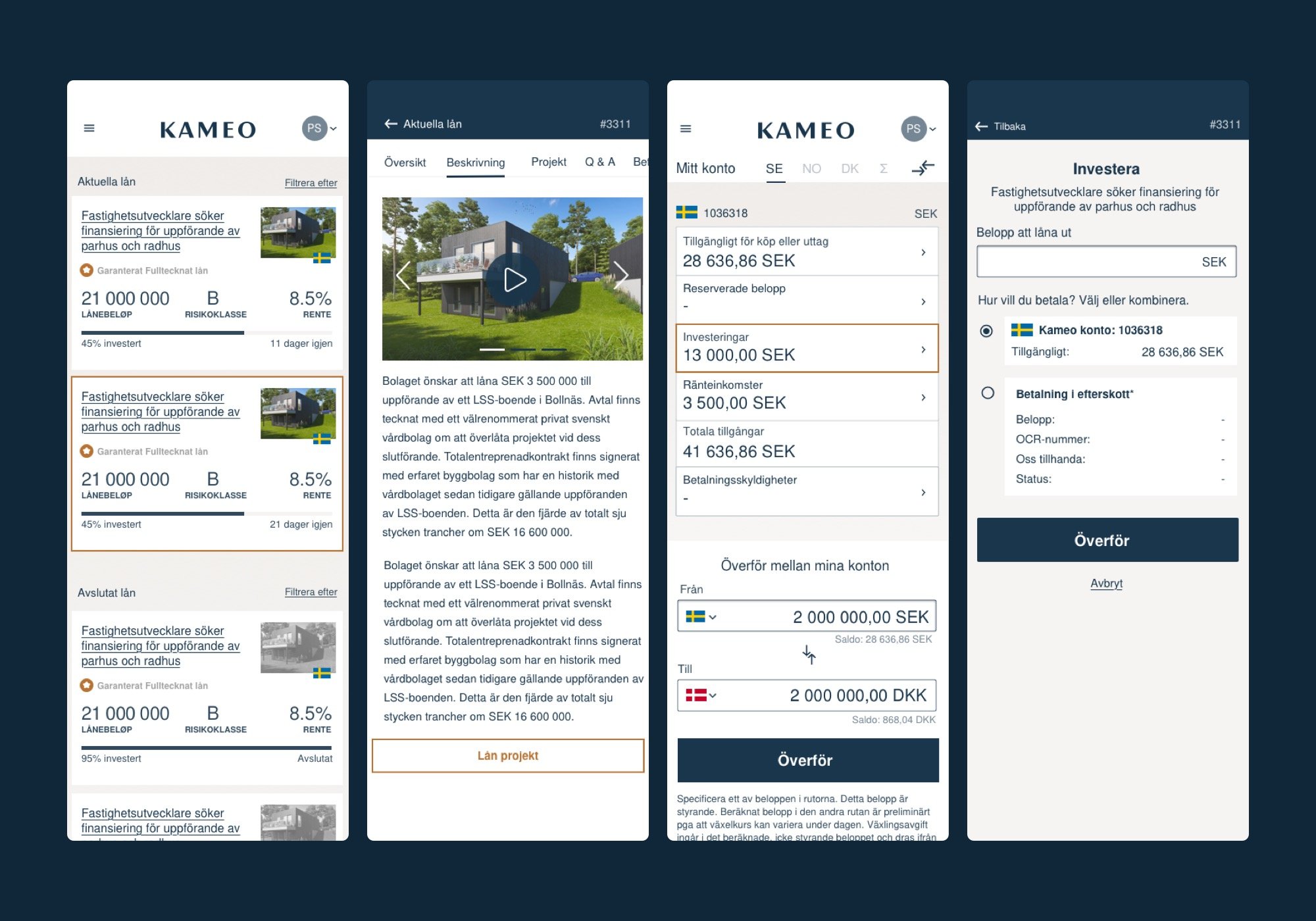
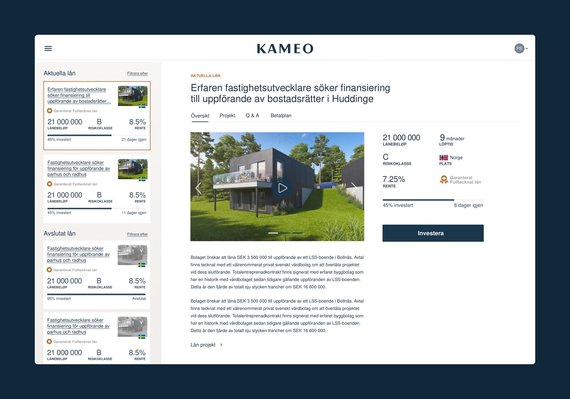
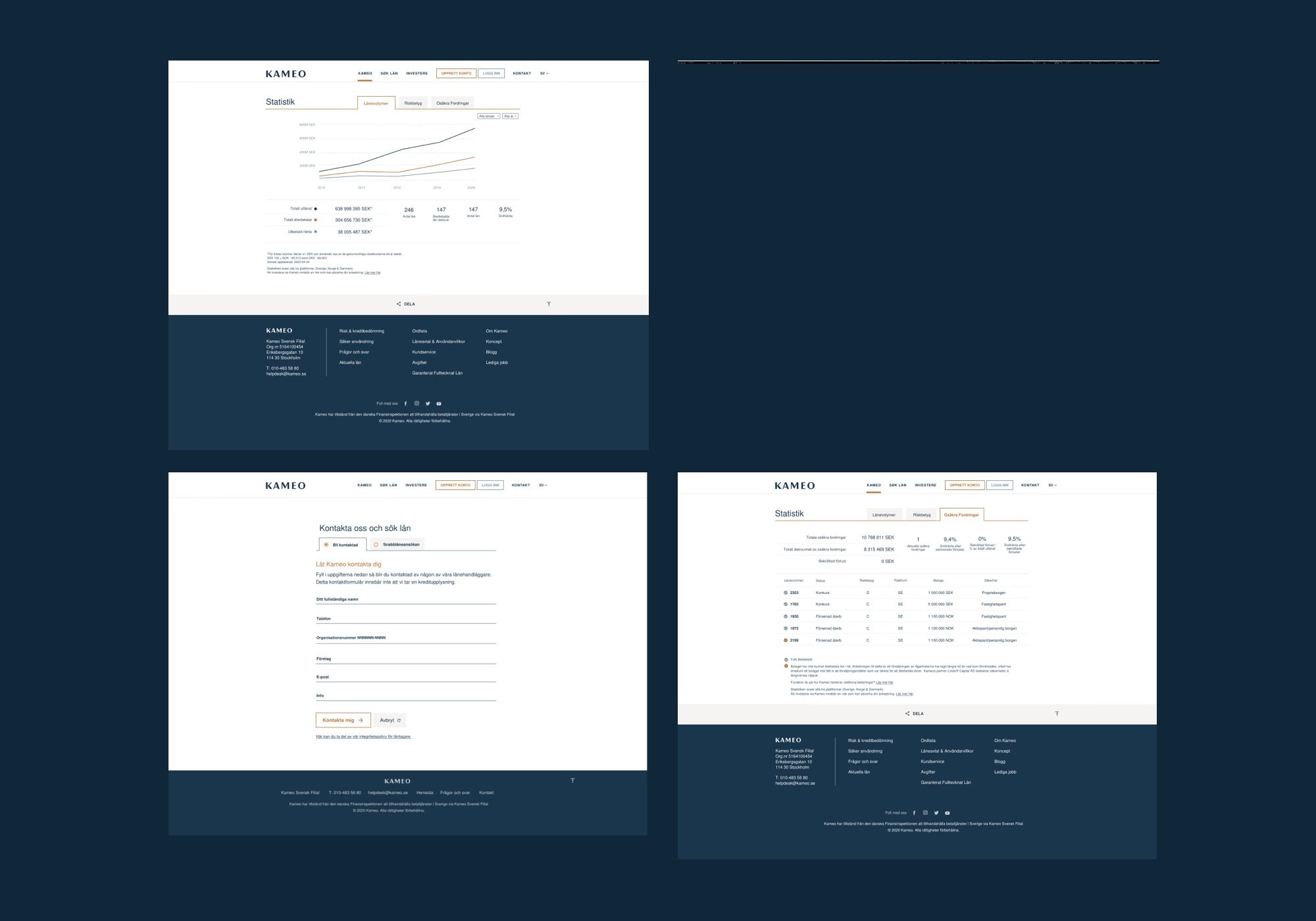
I was invited to participate in the creation of a new Cameo design for the website and later for a web application. A new visual identity was created and it had to be incorporated into the design. Brand guidelines were very basic, so I also created the necessary typography, secondary colors, angled/sharp look and feel. I created the main segments, main flows focused on user types, design and display of lists, and individual crowdfunding projects.
On the other hand, I created the application as a logical continuation of the website. The application also had the function of redesigning and entering advanced analysts that were not present until then. The design followed the lines sharply, cleanly, and elegantly.
Outcomes & Lessons Learned
I have established that the lack of communication with the decision-makers in companies can sometimes be the key issue. The top management has decided not to pursue change of identity and the website has retained its original appearance with a few minor improvements. The principle was: If everything runs smoothly, why should we change it?
